Tuesday, September 29, 2009
Wednesday, August 26, 2009
Duck and cover: MacWorld
A short time-lapse video showing the photography, Photoshop, and layout stages for a cover of MacWorld magazine. Call me crazy, but this seems like a lot of time and money spent to produce a cover that ends up looking essentially like nothing more than stock photography. (File under "reinventing the wheel.")
Cover creation from Peter Belanger on Vimeo.
"After working on the latest cover for Macworld Magazine I wanted to show what is involved in making a cover. I focused on the three main areas: the photography, photoshop and design. I chose a time lapse format to convey lots of information in a small amount of time. The only drawback of time lapse is that since half a day goes by in 30 seconds, the whole process seam so easy! Lots of details were left out of the design process (like the cover meetings and rounds of layout options). I began to photograph the design process after the layouts had already been narrowed down to just three cover designs."
Thursday, August 13, 2009
Duck and cover: The Pelican Project

The Pelican project: a collection of Pelican paperback covers from the 1930s to the 1980s
Wednesday, July 15, 2009
A question of balance: redesigning the Atlantic

Look behind the scenes at last fall's redesign of an icon of American journalism.
1. A general discussion: "For a graphic designer, few jobs are as challenging as designing a magazine. Unlike a logo or a poster, the design of which can rely on blunt simplicity, a magazine is a complex organism, the result of an intricate interplay of words and pictures. Any single issue represents thousands of minute decisions about typography, layout, photography, and illustration. And these decisions are made within an accepted system of conventions -- preconceptions we all share about how a magazine is read -- and more practical and mundane limitations like budgets and schedules...." A Question of Balance, the atlantic.com
2. A slightly more detailed take from the design studio: "When Pentagram undertook a redesign of the Atlantic -- the eighth in its history -- the goal was to establish an intelligent and striking framework for the magazine’s wide-ranging editorial voice."
3. Bonus gallery: 151 Years of Atlantic covers
Monday, July 13, 2009
Duck and cover: ASME's Top 40 Magazine Covers of the Last 40 Years

On October 17, 2005, the 40 greatest magazine covers of the last 40 years were unveiled at the 2005 American Magazine Conference (AMC) in Puerto Rico, by Mark Whitaker, Editor of Newsweek and President of American Society of Magazine Editors (ASME), and AMC Chairman Evan Smith, Editor of Texas Monthly.
Monday, July 6, 2009
Tuesday, June 9, 2009
Duck and Cover: The Economist

Frank's presentation on good covers inspired me to come up with a new department here at URMAblog, which I'm calling duck and cover. For the first installment, I humbly submit this one, from The Economist.

Tuesday, April 7, 2009
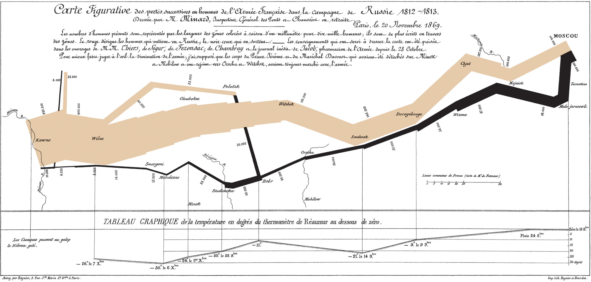
Tuesday coffee break: "the best statistical graphic ever drawn"

"Napoleon's March to Moscow, 1812: Beginning at the left on the Polish/Russian border, the thick band shows the size of the army (422,000 men) as it invaded Russia in June 1812. The width of the band indicates the size of the army at each place on the map. The path of Napoleon's retreat from Moscow is depicted by the darker, lower band, which is linked to a temperature scale and dates at the bottom of the chart. The crossing of the Berezina River was a disaster, and the army finally struggled back into Poland with only 10,000 men remaining. Charles Joseph Minard's graphic plots six variables: the size of the army, its location on a 2-D surface, direction of the army's movement, and temperature on various dates. The word 'Napoleon' does not appear. It well be the best statistical graphic ever drawn." --excerpted from Edward R. Tufte, The Visual Display of Quantitative Information
Tuesday, March 17, 2009
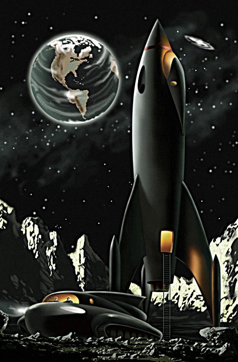
Tuesday coffee break, part 2: Vintage visions of the future

"Soviet and Eastern Bloc popular tech and science magazines, German, Italian, British fantastic illustrations and promotional literature -- all from the Golden Age of Retro-Future."
Thursday, June 12, 2008
Bad reasons to redesign
From the book Designing Magazines, Jandos Rothstein, 2007:
Staff boredom: "There is no better reason to redesign than reader boredom. Staff boredom, on the other hand, is best ignored — at least for a while.... The typical reader will spend anywhere from fifteen minutes to three hours with [your magazine]. It is likely that the staff will be tired of a new design before its premiere, thanks to all the hours that went into the format's preparation."
Staff changes: "There are lots of times when a new publisher, editor, or design director will come into an organization and leverage his or her outsider perspective and energy to become the driving force for an overdue or otherwise needed redesign. There are other times when a new person advocates changes to make the publication more personally comfortable or simply to be able to point to a major accomplishment under his or her stewardship....How can you tell the difference between ego and vision? ...Arbitrary changes are likely to be poor changes."
Monday, June 9, 2008
Monday inspiration
Black and white photography (Smashing Magazine)
Thursday, May 1, 2008
An open letter (rant) to photographers, art directors, and editors

I've yet to visit a lab where the walls and equipment were glowing purple. Or red. Or blue. Or fuschia....
So why do we continue to run pictures of labs bathed in colored light that makes them look like Willy Wonka threw up in them?
We've all done it. We've overdone it. It's cliché. It doesn't make the researcher or the lab look high-tech; it makes them look like a bad music video from 1982.
The culprits are called color gels. The photographer tapes a few onto his lights, and presto! Instant scientific credibility:

This orange fluid I'm putting in this beaker sure looks high-tech. And maybe hazardous. I hope I don't drop it.

Now that my office is purple, I can really get some stuff done. Like posing for this picture. Is my smile okay? Is it?

Is THIS what's causing my ceiling to be purple? Here, let me turn this damn thing off.

The Teknai EDAX X-ray spectrometer. Without purple lights: expensive. With purple lights: priceless.

The man who took this photo was planning to become a scientist, until he found out that the labs look like this. He killed himself four months later.
So next time the color gels come out, remember this:


